Skip to content

If Classic Soccer Club Logos Were Created in America or When Good Logos go Bad

2011 February 16
by Brian Quarstad

Yesterday I went on another one of my rants questioning why American soccer team logos seem to always have the 1970′s Adidas Telstar style black and white soccer ball on them.

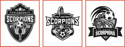
This all came up in the discussion of San Antonio’s 3 finalists for their team logo. All three had the old black and white soccer ball again. Which led to more discussion in the comments of that article and on twitter. The question I always come back to is: Why is it that so many organizations feel the need to add the ball? And not just any ball but the black and white Telstar?

Some will say it has to be on the logo so those not familiar with the team will know what sort of a sport the logo represents. I certainly question that response and say why not use that as an opening to a great conversation about the team and the sport. Besides, there are lots of teams logos from all sorts of sports with no ball, puck, stick, bat or whatever on it. The logo represents the organization, not the sport.

Don’t get me wrong, I’m not opposed to balls being used in logos. But be creative, please.

My friend KJ designed the new IMS logo and you can tell it’s a ball but it’s abstract. Another example of the abstract soccer ball is the Irish FA. I really like that logo as well.

I was told recently by an owner of a USL PRO team that USL requires all teams to have soccer balls in their logos. But checking the USL PRO website reveals there are 5 out of the 15 teams that don’t have balls on their logos. A few of those that do have actually done a nice job in resisting the status quo Telstar.

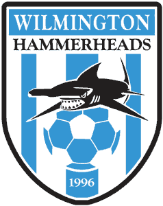
The Wilmington Hammerheads have done a nice job of creating a logo, using a soccer ball but incorporating it into something unique but in a pleasing and interesting manner. More importantly it does not sport a ’70′s Tellstar. Check out Puerto Rico United’s logo, it’s another good one.

So this all got me to thinking. What if some of the bigger soccer clubs did what we always seem to want to do in the U.S.? That is, place the old Adidas Telstar in their logo.

So here you go. I have put together some rough images of some world renowned club logos with a US version (Adidas Telstar) next to the original logo.

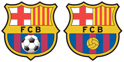
Barcelona: Alright, I enlarged the black and white ball for effect. But even if it was smaller, you take a classic logo and kill it with the good old Telstar.

Bayern Munich: Need I say anything more? Great logo for the U-8 rec league.

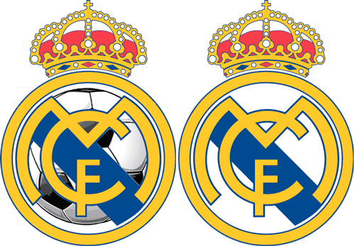
Real Madrid: It certainly doesn’t look so royal anymore.

More logos after the jump…

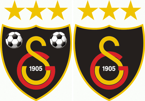
Galatasaray : Again, perhaps a bit extreme but I didn’t know what else to do with the balls.

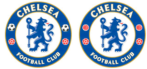
Chelsea: Subtle but a killer. What if I had put one atop that scepter? Now that would have been the icing on the cake.

FC Internazionale Milano (AKA Inter-Milan): Again, there wasn’t a lot of room on here for a soccer ball so I had to get creative.

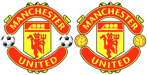
Manchester United: It didn’t change this logo as much as I thought. Still, a classic logo gone bad.

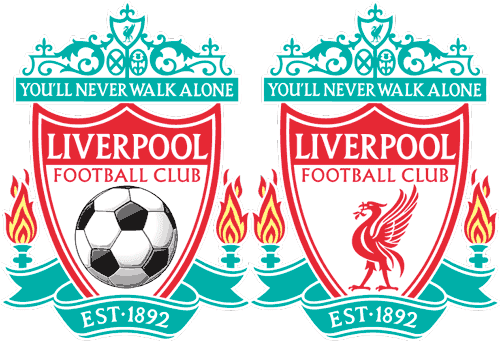
Liverpool: You’ll never walk alone unless you’re sporting this Americanized version of the Liverpool logo.

15 Responses
  1. B.Lindsay permalink
    February 16, 2011

    “My friend KJ designed the new IMS logo and you can tell it’s a ball but it’s abstract.”

    I just assumed your favourite JLA villain was Starro the Conqueror.

    But yeah, the ball seen in the logos of Barcelona and others is classy. The telstar looks minor league – doubly minor league when it’s on fire.

  2. uhclem permalink
    February 16, 2011

    More later, but your monomaniacal campaign against the use of the “Buckyball” in soccer club logos seems to have unhinged your mind. ;) On the Hammerheads logo; pentagon shaped panels surrounded by hexagonal shaped panels…that’s a ”buckyball”. Again, barring the first combine list coming through before, more later.

  3. Soccer Boy permalink
    February 16, 2011

    I actually like the Americanized Liverpool logo! Wait a second, I love the buckeyball!

  4. Eaashley79 permalink
    February 16, 2011

    If I could read minds, I would certainly conversate with anyone interested about the sport and the team. Unfortunately, I can only hope that when someone sees my t-shirt with the Scorpions logo, they think “Oh, that must be the new professional soccer team in town” or “I’ve never heard of a local soccer team called the Scorpions, who are they?” Even better, they approach me wanting information about the team and I invite them to a game and buy them a beer. In a perfect world, it’s a beautiful woman talking to me about local soccer, but now I’m getting ahead of myself.

    Ultimately, I agree with you. I dislike the old-school soccer ball on logos as much as anyone else. But I think if you’re a fledgling franchise trying to connect with a community at large, especially one like San Antonio that has never experienced the sport on a professional level (a couple years in the old NASL doesn’t count), you can’t go wrong including the buckyball on the logo. Now 10 years down the road when the team is established, stable, financially secure, etc. (crossing fingers), I’ll be the first one to say it’s time to update the logo.

  5. Robin permalink
    February 16, 2011

    1) Ok I like the article

    2) Where is Arsenal FC, try remembering us, we just beat Barcelona 2-1. What more can we do to get respect in America.

  6. Grant Stephens permalink
    February 17, 2011

    Nice rant. I like it!

    FC Tampa Bay has a ball, but its that Barca-style old school ball. Its so subtle that you hardly notice it at all.

    Maybe the Telstar design should be relegated to youth level and indoor (see: Baltimore Blast)

    Another bad American logo trend that always makes me laugh is the overly-detailed mascot. For example, take the San Antonio logo on the far right. Do we really need to see his facial expression as he stings the ball? Do we need to see the whites of a scorpions eye? The first logo is more classy as we only need to be reminded of what a scorpion looks like. Now, look at the Manchester Utd. logo or the Chelsea’s Logo. Both are suggestive of what those mascots are, not a huge Red Devil, grinning, and busting out of the logo pointing a pitchfork at you.

    Now Im gonna be looking up old logos for the next hour…

  7. CoconutMonkey permalink
    February 17, 2011

    Ha ha.

    Personally, I don’t have a huge problem with the bucky ball. However, flying/flaming bucky balls have to stop.

    I’m looking at you USL!

  8. February 17, 2011

    OK Robin, just for you. Hard to do much with this classic logo except put a ball in the hub. Hope your feeling better now, but sheesh! You come up with a huge win against Barca and that’s not enough for you? No, you want me to honor your team with a bad logo beside. Talk about wanting your cake and eating it too! ;)

  9. tomASS permalink
    February 17, 2011

    @soccer boy – BLASPHEME!

  10. ERic permalink
    February 17, 2011

    I’m not entirely sure I mind the buckyball. It was iconic, and there are actually a surprising number of NBA and MLB teams with their sport’s ball in their logos.

    But I’m with CoconutMonkey. NO FLAMING SOCCER BALLS.

    And death to cartoon characters as well. That’s so 80′s.

    And shading/faux 3-d effects. I want my logo flat and clean.

    All three of those are kinda weak, I think, but if I must pick, I’ll go with #1, like most everyone else.

  11. February 17, 2011

    I thought you would get a kick out of this.

    http://www.horriblelogos.com/

  12. thesuperrookie permalink
    February 17, 2011

    FC NEW YORK HAS THE BEST LOGO EVER.

    Fact.

  13. Jim permalink
    February 17, 2011

    Gotta say that Ft. Lauderdale Strikers badge is pretty classy looking. Just letters, baby. Hot.

  14. February 17, 2011

    There is not logo yet. That is a secondary logo. The first with the badge is yet to be revealed. Coming soon.

  15. Erik permalink
    February 22, 2011

    when I read this on google reader, the google ad at the bottom was for soccer ball patches – they were black and white telstars. talk about your awesome algorithm fail.

Comments are closed.