North American Soccer League Reveals New “NASL” Logos
The NASL not only announced their new league commissioner this morning in David Downs, but have now revealed a new look website (a big improvement over the old one) and their new logo and word mark logo as well.
The logo and secondary word mark were designed by Rich Levy of 343RLP+ Creative Group. Levy formerly served as the Creative Director for Major League Soccer and Soccer United Marketing.
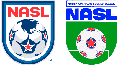
The new North American Soccer League logo has a similar look to the old NASL logo that was used in the 70s and 80s but has an updated look and colors.
Gone is the green color that was used with a field but the star-ball is still used with the same basic colors and a change with points coming off each pentagon.
The logo also brings in a slightly different blue color to the mix with an offsetting light blue accent.
The NASL wording is similar to the old NASL font but it has slimmed down and changed to red. This same font and color scheme runs though the new word mark logo as well.

NASL word mark logo
There is also a reference to a globe on the ball which is nothing unique for a soccer logo but this one nicely done and simply features North America.
Overall a very nice logo that will display well in various applications.

New and old NASL side by side.
Comments are closed.
Wow! Ok, here I am very impressed! This new primary logo for the league is excellent! Love the homage to the original that was brilliantly updated for today. Especially like the North American silhouette on top of the ball. Very nice!
Doesn’t look like they’ve updated the website as of yet, but looking forward to seeing that as well!
I know a number of people that are not seeing the new website. You may need to flush your cache of your browser and then refresh by going back to the website. But it is up and it looks good.
Ok, I was a little too quick, it’s up now, and again, I am very impressed. They really did a good job of making the site look much more professional then before. Everything I have seen from the league so far this year has been positive in my opinion. I am hopeful that at the team level, fans are getting a positive feel about their organizations as well. I know for sure we are down here in South Florida. Can’t wait for the season to kick off!
It’s a very nice looking logo that we got.
very nice update to the classic logo, does anybody know if the league plans to use the star-ball in games?
I love that logo.
I would wear a tshirt if it had that logo on it.
dig the new logo
Very sharp.
So nice. Nothing bad to say about the new NASL look.
And since the ball is on the logo, and it’s one of the real cornerstone images of the NASL, I imagine they will have the official ball look like that at some point. So awesome!!
Big Improvement but it was going to have to be considering that old one looked like an afterthought or something that somebody’s 8th greade niece developed.
Too bad FCNY is in the USL because they could use the logo help.
I’m really surprised that BQ and some other types haven’t complained about the fact that there is a soccer ball incorporated in the logo.
I have never complained about soccer balls being in logos. Only complain about the traditional 70′s look Tellstar black and white that keeps on appearing on minor league and youth logos. This is traditional and cool. Look at the the Ft. Lauderdale logo. That has a ball on it as well but it’s abstract. Thats fine in my book.
BQ, don’t disrepect the Tellstar!
It’s better than “tradiional”–it’s a freaking classic. It’s abstract. It’s old skool, kinda like me Playah.
Love the new logo, especially the silhouette of North America. I could be more wild about those spikes sticking out of the pentagons which hold the star, but it looks excellent despite them. The website is fantastic.
Now if the league’s focus on 21st century design elements extends to sales, marketing, and the product on the field, we’ll be set.
Yanki:
(Shameless self-promotion for no good reason:)
About a month or so ago, I wanted to stretch my design legs a bit, so I did a mockup of a new FCNY identity:
^ That’s a million times better than then real one.
I swear, who approves these things? Give me 2 hours and I could find a dozen talented young designers willing to develop identities for next to nothing. If these teams don’t want to spend on a big time design firm(like the NASL and Strikers did), they should seek out local young pros or students.
By the way, I’d love to see the NASL logo on the sleeve of every teams uniforms.
love the new logo: “Faithful and Progressive”
It’s faithful to the history of the NASL, but progressive about updating to be in entertaining in the 21st century. Love it!
Clean and classy. Looking good NASL.
As for the bucky ball, I think a lot of crests have incorporated it quite well, notably Mexico.
My beef is with the flying and or flaming bucky ball. It’s like saying “let’s make sure everyone knows we’re a soccer team. An XTREME soccer team!”
I know for a fact that the logo is intended to be on the sleeve of every team. I am also under the impression that the new balls will be made to resemble the one on the new logo. I cannot wait for this season to start!
Mad props to kj and the sweet redesign of the FCNY id. (Beats the hell out of clip art!)
BTW, KJ also designed the new IMS logo.
KJ, good job on the “FC Clip Art” logo. Hopefully someone in NY is paying attention. Your work-up is top notch!
I agree with BQ, all teams in the NASL should have the league logo on their jerseys–or at least the league owned teams….
@KJ: Bro–you services are desperatly needed in New York!
That is a leaps and bounds over what FCNY miracoulsously decided to go with.
It’s traditional. It’s got a nice, strong feel. It also incorporates the key cultural, elements that the club aspired to when they explained their previous excuse of a shield. It also lends itself to “urban” sensibilities.
Make a black, third/alternative jersey adn I think that you could sell that thing to guys who just wanted to rep NYC, especially Queens.
Nice! Let me know when you are ready to make your pitch to FCNY. If I can, i want to sit in and diplomatically tell them the obvious–their current logo SUCKS but yours can help extend their brand to non-soccer fans.