FC Edmonton Unveil Custom Kits for 2012
FC Edmonton revealed their new Adidas custom kits for 2012 at a press conference yesterday that also included an announcement of their new home venue for the 2012 season.
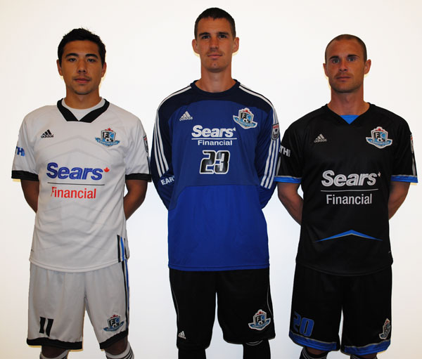
Matt Gresiuk, from Sticks & Stones Marketing, explained that because the team has entered into a multi-year deal with Adidas it has allowed the Eddies to design custom kits with the apparel giant. “This kit is completely unique to FC Edmonton,” said Gresiuk.
This year’s home kit switches to black with highlights of the City of Edmonton’s signature blue. The away kit is white on white. On both kits you will find chevrons which draws its inspiration from the many pyramids found throughout Edmonton including City Hall.
Like 2011, Sears Financial will again be the FC Edmonton’s kit sponsor.
Click ‘read more’ to see more photos of Edmonton’s 2012 kits—>
Comments are closed.


Wow, Edmonton can get a custom kit from Adidas but many MLS teams cannot?!
Not a fan of BFBS and would have preferred to see a blue kit, but Edmonton pulled off the inverted color scheme better than San Jose.
It’s not really black for black’s sake when it’s one of the team’s primary colors.
Well done Edmonton.
Meh. But good on them for being able to get a custom kit from Adidas. De gustibus non disbutandum est.
The Year of the Ugly Kit continues. I am not inspired…
@Soccer Boy
Really? The colors don’t clash, and the mess of random swoops and swirls or the gratuitous silver straps that have marred many recent adidas designs are absent. Even the trademark shoulder stripes are truncated down to just a bit on the sleeves. These are some of the crispest, cleanest kits put out by adidas in recent years. I consider myself a fairly imaginative person, but I don’t see how these kits could be considered ugly by any stretch of the imagination.
Soccer boy is jealous. Give him time.
I don’t see ugly in those kits at all. Perhaps you could call them bland (I don’t), but ugly? Nope. Personally, I like a clean, straightforward look with a slight touch of flair over the hoopy outfits with blinding colors that are all the rage lately.
If you really want to see ugly, check out the…errm…’new’ look the Rowdies just unveiled. Be sure to set your watch back 40 years first.
PS: Why does everything from Canada have to include the maple leaf? To me it is kind of a self-esteem issue or something. Ugh!