Skip to content

Tampa Bay Rowdies Reveal 2012 Custom Kits

2012 April 2
by Brian Quarstad

Andres Arango models this year's home and away Rowdies kit. Click to enlarge.

The Tampa Bay Rowdies showed off their new 2012 kits on Friday night at a team sponsored party.

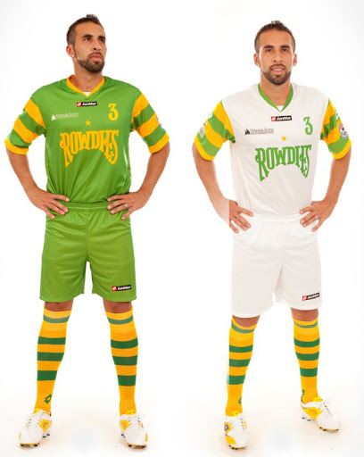
The new custom Lotto-manufactured uniforms may be the sharpest yet for the team with deep NASL roots going back to 1975. The Rowdies were Tampa Bay’s first-ever professional sports franchise.

This year’s uniform colors are white for the home and green away. The traditional gold and green hoops have migrated from the waist to the sleeves on both uniforms allowing the new/old Rowdies logo on the chest.

The back of the jersey features the words Tampa Bay under the collar and the left sleeve features the North American Soccer League logo. The kit numbers include the custom Rowdies font.

The team has negotiated a deal to use the old Rowdies name and use it they have. While quite large the symmetry of the wordmark Rowdies logo fits well on the uniform and keeps the otherwise solid colored kit looking balanced.

It looks as if sleeves and socks will be consistent between both home and away kits for the Tampa Bay side and while busy, compliments the solid colors of the primary part of the kit.

The shorts are also solid but are stove pipe-like which is unique but perhaps not my favorite style.

A spokesperson for the team said the uniforms were designed in house by the Rowdies front office. That process was led by Andrew Nestor and Lee Cohen, developing ideas with in-house graphic designers, and then had several focus groups and sessions with the rest of the ownership group and front office to review ideas.

Both jerseys are available online and the team says they will be adding more Rowdies products to their online store this season.

Overall it’s another very nice addition to all the NASL 2012 custom uniforms this season.

Get the flash player here: http://www.adobe.com/flashplayer

12 Responses
  1. thesuperrookie permalink
    April 2, 2012

    Does Umbro own Lotto?

  2. Steve permalink
    April 2, 2012

    The Wrangler with his “MY PACKAGE! LOOK AT IT!” stance will never cease to amuse me.

  3. April 2, 2012

    Yes, major screw up on my part. It’s fixed.

  4. yankiboy permalink
    April 2, 2012

    The jersey??? It’s a Rowdies jersey. A throwback. Not like they can really mess it up or do anything to make it better than what it is. How much design time could have really been involved?

    The star is still a joke. We are licensing the name so we are licensing the history. Even the PT Barnum known as Soccer Sam wasn’t pompous or desperate enough to put a star on the MISL Rochester Lancers jersey.

  5. Soccer Boy permalink
    April 2, 2012

    I will give the Rowdies a pass on the hoops based solely on the fact that they have a history of having that in their kit design. The kit does make me want to install green shag carpet and a disco ball. I am getting nervous that the Stats will do something similar. If so, this year will be forever known as The Year of the Ugly Kit!

    PS: I think most of these guys were born in the 1980s? Do they understand the historical significance? I feel old!

  6. Jim Oliver permalink
    April 2, 2012

    Wynalda made me laugh out loud on FSC this weekend when he referred to Norwich City as “wearing Tampa Bay Rowdies green and gold.” I pictured NCFC fans doing spit takes.

  7. April 2, 2012

    Rowdies wore these jerseys(more or less) until 1993 when they were in the APSL(I think they were still the original organization if I’m not mistaken). Can’t go wrong with the classic shirts… except for adding that fraudulent star.

    As a Striker Liker I love to hate them, but they are awesome shirts.

  8. Steve permalink
    April 2, 2012

    The photos are altered quite a bit. They’re basically the home jerseys for the last two years, with a Rowdies logo instead of FC TAMPA BAY across the top. Thankfully, the white one is lacking the silly yellow bib from the 2010 home kit, though.

  9. jedinathan permalink
    April 2, 2012

    @yankiboy
    THANK YOU! The star above the logo (FC Tampa Bay or the Rowdies) has always bugged me.

    To me the only team that deserves to wear one in 2012 is Minnesota.

  10. Strikers Return permalink
    April 3, 2012

    No more ridiculous blue kits for the resurrected Rowdies is good. People can make all the shag carpet and 40 year old jokes they want. This team needed the brand back this year to see if they can build a strong enough fanbase to fend off USL’s entry into the market, as well as get to the level that would mean long term stability. Plus there’s nothing like a true rivalry reborn…..Strikers vs. Rowdies…..CAN NOT WAIT!!!!!

  11. April 4, 2012

    hatters gonna hat. Some of you consistent hatters are a trip, but at least you are consistent in your hatting (this is me rolling my eyes)

    I just wish they had got the lighting right for the press photo. The green away kits are the same color green as last year’s home jerseys, and a fair bit darker than this image makes them out to be.

    Oh well, can’t wait to get mine!

  12. meh permalink
    April 4, 2012

    Snarky comments about the Rowdies star would carry a lot more weight if the league they play in hadn’t chosen the NASL name and hadn’t chosen to call its championship the Soccer Bowl.

Comments are closed.