USL PRO Teams Orlando City and LA Blues Unveil Logos

2010 December 18
by Brian Quarstad

The Orlando City Soccer Club and Los Angeles Blues both unveiled their team logos this past week.

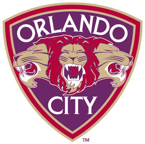
For the Orlando City SC, three lions will brace their logo with red, purple and gold as primary colors.

According to the team’s release, the “Lion Heads” mark symbolizes our group effort and connects the past traditions of soccer in Orlando with our own bright future. In addition, the word “pride” is the collective noun for lions. We are proud of what we do. We know we must be greater than the sum of our individual parts, we must be a team. Together we can accomplish our goals. Together we win. In that regard, the three lion heads also represent the three facets of the game we love: defense, midfield, and attack. The three lion heads also provides us with our nickname, “The Lions.”

The logo was created by Dixon Minear Design Marketing and also has a monogram.

The Los Angeles Blues USL PRO men’s team will share their base logo with its sister team, the Pali Blues W-League Soccer Club that was founded in 2008. The logo does change slightly for the men’s team with their team name swapping for Pali Blues and dark blue colors dominate where the Pali Blues logo features light blue.

According to their press release, the Los Angeles Blues logo features the blue of the California sky and the dark azure of the Pacific as the main characteristics of the LA Blues logo, paying homage to its home region.

17 Responses
  1. thesuperrookie permalink
    December 19, 2010

    Hakuna Matata.

  2. December 19, 2010

    Thank you Sterling Cooper Draper Pryce for those logos.

  3. Garrett permalink
    December 19, 2010

    Orlando City’s logo must be in conjunction with the release of The Lion King 8: We Can Still Make Money Off This Brand.

    If you have to write a separate press release to explain the meaning of your logo, you’re doing it wrong. Well done OC$C….

  4. JXU permalink
    December 19, 2010

    The OC logo looks like a fan-drawn submission, and doesn’t at all match the monogram. The same firm designed both?

  5. Grant Stephens permalink
    December 19, 2010

    Looks like a cereal box logo! Was it designed by General Mills?

  6. pony permalink
    December 19, 2010

    Am I the only person who actually likes them?

  7. December 19, 2010

    That LA Blues logo (as with the name) is fantastically terrible. It defies our ability to really define just how terrible it is. Wow. I want to give it a slow clap standing ovation.

  8. Drebin permalink
    December 19, 2010

    They should just have fans submit their own designs or have them vote for the best ones. Not having any form of community input makes their attempt to connect with fans count for nothing.

  9. Blue and White Army permalink
    December 19, 2010

    So the Phil Rawlins travelling road show has a new (temporary) home.

    Who cares?

    Why would any soccer fans from Orlando invest any emotional currency in the American version of Milton Keynes Dons? At the first sign of trouble, this “franchise” will bugger off to a bigger, better city.

  10. Bart permalink
    December 19, 2010

    Now, now, Blue and White Army, it is the Christmas season. Let’s give some good will and charity to all.

  11. Ultra permalink
    December 19, 2010

    Ugh both logos are terrible. The “OC” Orlando logo is the best, but it’s still not great.

    If either club had asked for fan submissions they would’ve gotten better results. There are pro designers and hobbyists out there who would kill to design a pro team’s logo. Or they could just hit up their local art college, as I’m sure there are dozens of talented graphic design students who could’ve done much better jobs, and probably would have done it for less money.

    Awful!

  12. Brendan permalink
    December 19, 2010

    Do you guys just like to see your own names on the internet? Logos aren’t really important between a symbolic significance. And if you don’t live in either of the two markets then why do you care at all?

  13. Chris A. permalink
    December 19, 2010

    @Brendan – You misunderstand the vital self-importance people have in letting everyone know that they are smarter than other people. :)

  14. Flacotex permalink
    December 19, 2010

    Ugh, maybe OCFC can hire the Lion King dinner theatre performers at Disney to perform a introduction ceremony before each game. It would match the logo. Kids would love it.
    That Pali Blues mountain and water image is straight out of 1970′s paperback survival handbook. You know, the one with the simplistic images drawn in the margins.

    But I grumble, what else is a critic but yet another supporter of an american soccer team that ‘failed’ (in my case Milton Keynes style)?

  15. December 19, 2010

    Both of them are truly hideous.

  16. Soccer Boy permalink
    December 19, 2010

    No soccer balls. I like’em!

  17. yankiboy permalink
    December 20, 2010

    Dude, the Three Lions in the Orlando City logo ROCKS!!!
    Do they have some sort of English connection or something???

Comments are closed.